Colorful revolutions: Oatly, Liquid Death, MTV, Merck and Braniff – stories about iconic visual identities
Stand out or die.
Introduction
Stand out or die – as marketing guru Jack Trout said. Today, in the era of consumerism, apart from a good product, service or great customer service, it is important to stand out from the competition.
In the world of brands, visual revolutions happen that change the rules of the game forever. Here are five stories about companies from various industries, from plant-based drinks to airlines, that focused on unconventional visual communication. Their courage in choosing colors, typography and graphic style made their images unique, effective, and often even iconic. Let’s learn the stories of Oatly, Liquid Death, MTV (the golden times of the 80s and 90s), German Merck and Braniff International Airways – brands thatbroke the standardsand proved that design can be stronger than a thousand words.
Oatly – when the packaging speaks with the voice of the brand
The Swedish company Oatly started as a typical oat drink manufacturer, its old cartons did not stand out on the shelf. Everything changed in 2014, when CEO Toni Petersson took over and John Schoolcraft took over the image creation.

https://thechallengerproject.com/blog/2016/oatly
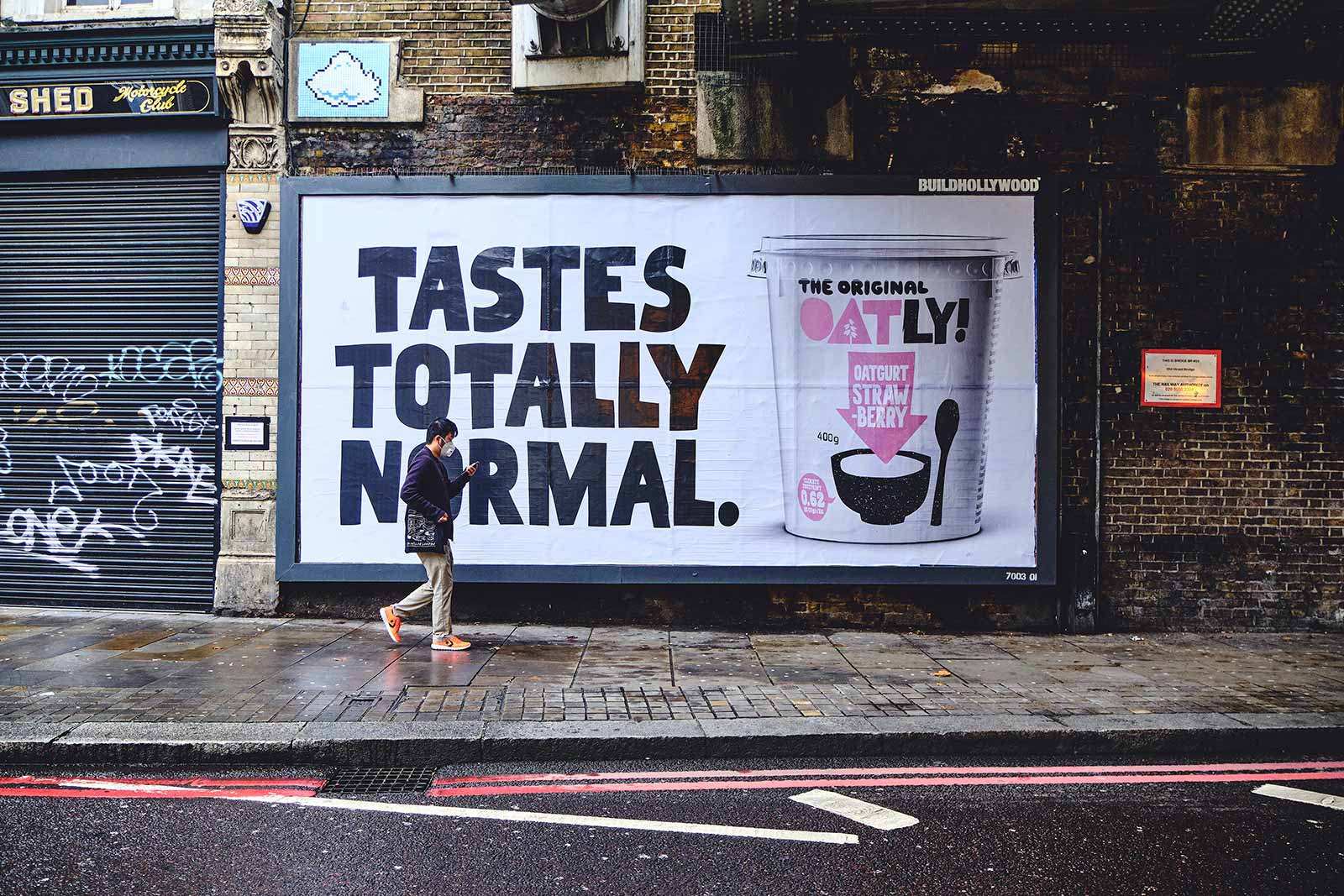
They decided to exchangepackaging in an advertising poster– a medium to convey the brand’s personality. Instead of another carton „pretending” to be milk, a rebel appeared: a carton covered with hand-drawn typography and humorous slogans. great,direct sloganslike „WOW, WOW!” (“Wow, no cows!”) or “IT’S LIKE MILK, BUT MADE FOR HUMANS” immediately attracted attention and made people smile. Thishandletteringit deliberately looked like it was made in a notebook – with uneven lines and a „human” character, which gave Oatly packaging authenticity and ease, while remaining legible from a distance.
Oatly’s colors have broken with the white and blue scheme typical for dairy products. Instead, the brand introducedyour company bluewith a shade of light sky (RGB 171,206,226) as the main color, complemented by a paletteearthy browns and vibrant greensto mark different flavors and eco versions. A lotwhite spaceon cardboard adds a premium feel and highlights key messages. Such a bold, contrasting selection of colors makes Oatly boxes immediately stand out on the store shelfthey „scream” with color and content, while the competition whispers. What’s more,graphic layoutis unconventional: instead of a polite hierarchy of elements, we have asymmetric compositions and text overlapping illustrations, as if each wall of the cardboard was a magazine cover.
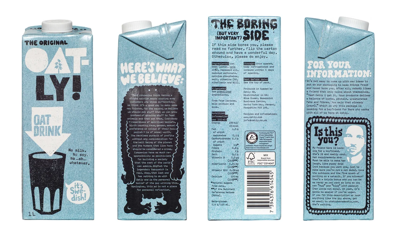
Behind this metamorphosis was the belief thatthe brand must be expressive and uncompromisingto change consumer habits. Oatly on purposebroke industry conventions: there is no photo of a glass of milk or a cow on the packaging, but there is a joke and a manifesto. “We treated packaging like our main media,” the creative team recalled, consciouslythrowing the existing design into the trashand at the risk that the change may be shocking at first. Indeed, the first reaction of some employees was full of disbelief – the new cartons seemed to them „childish” and too revolutionary. However, it quickly turned out that this courage paid off. Out of curiosity, customers reached for the box with the words to read, and once they tried the contents, they became fans. Oatly not only stood out from the crowd, but also built a group of loyal customers who loved the brand for itsdirect, slightly rebellious stylecommunication. What’s more, competitors began to imitate this style: after the success of Oatly, even the giants of dairy alternatives changed their packaging to bolder, looser and modern typography. This is how the inconspicuous oat drink becameiconic brand, which speaks to consumers in a human voice and with a wink, all thanks to brilliant visual communication.
Liquid Death – the murderous aesthetics of water in a can
A black can with a skulldrifts in the ice. This is not a scene from a heavy metal concert, but Liquid Death spring water on a store shelf. The brand name itself (Liquid Death) sounds like a metal band or an energy drink, not mineral water. And that’s exactly what the creators wanted. The California-based startup, founded in 2019 by Mike Cessario, decided“kill boredom”in the bottled water category, giving its product an image straight from an underground festival. Instead of crystalline mountains and blue drops, the packaging features a Gothic font, a flaming skull and the slogan „Murder Your Thirst”.
Black, white and gold colorscans andlogostylized asmetal typographymake the product look more like a can of craft beer or an energy drink than ordinary water. This perverse image immediately attracts the attention of people who want to stand out and emphasize their rebellious lifestyle.
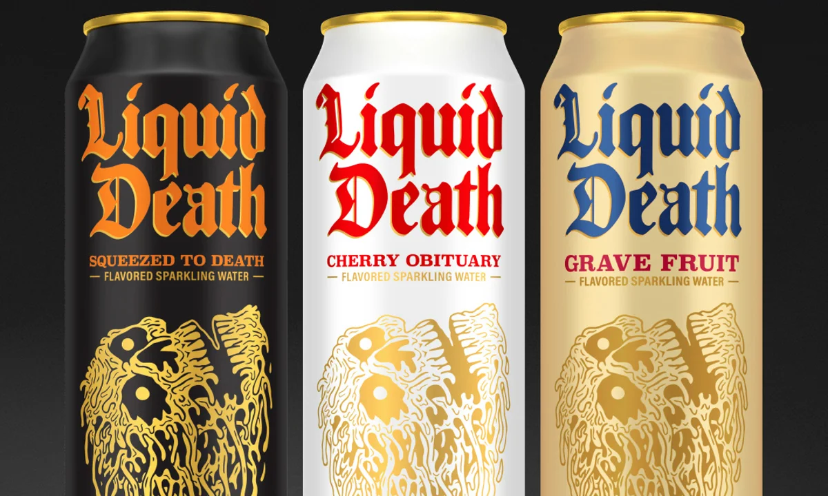
The originators of Liquid Death consciously chose thisthe aesthetics of a heavy metal poster– razor-sharp letters, death motif (skull) to liven up the most ordinary of drinks. As they explained, they wanted the name and graphics like thisprovocative and unexpectedso that no one misses it in the flood of „polite” water brands1. Indeed, the contrast between the predatory exterior and the fact that there is pure mountain water inside turned out to be a marketing genius.Branding with a pinch of salt, pretends to be dangerous, but has a positive message. Liquid Death distances itself from plastic bottles (water is sold in cans for recycling) and donates part of its profits to ecological causes, which is reflected in the communication full of dark humor. In other words, the brand says: you can be eco without being a saint.
Liquid Death’s visual communication works so well becausebreaks all expectationstowards a product as banal as water. Where competitors focus on transparency and blue accents suggesting purity, Liquid Death strikes with black and iconography straight from a horror movie.The audience effect?Young consumers loved this perversity.Business effect?Revenue from $3 million to $333 in 2024.
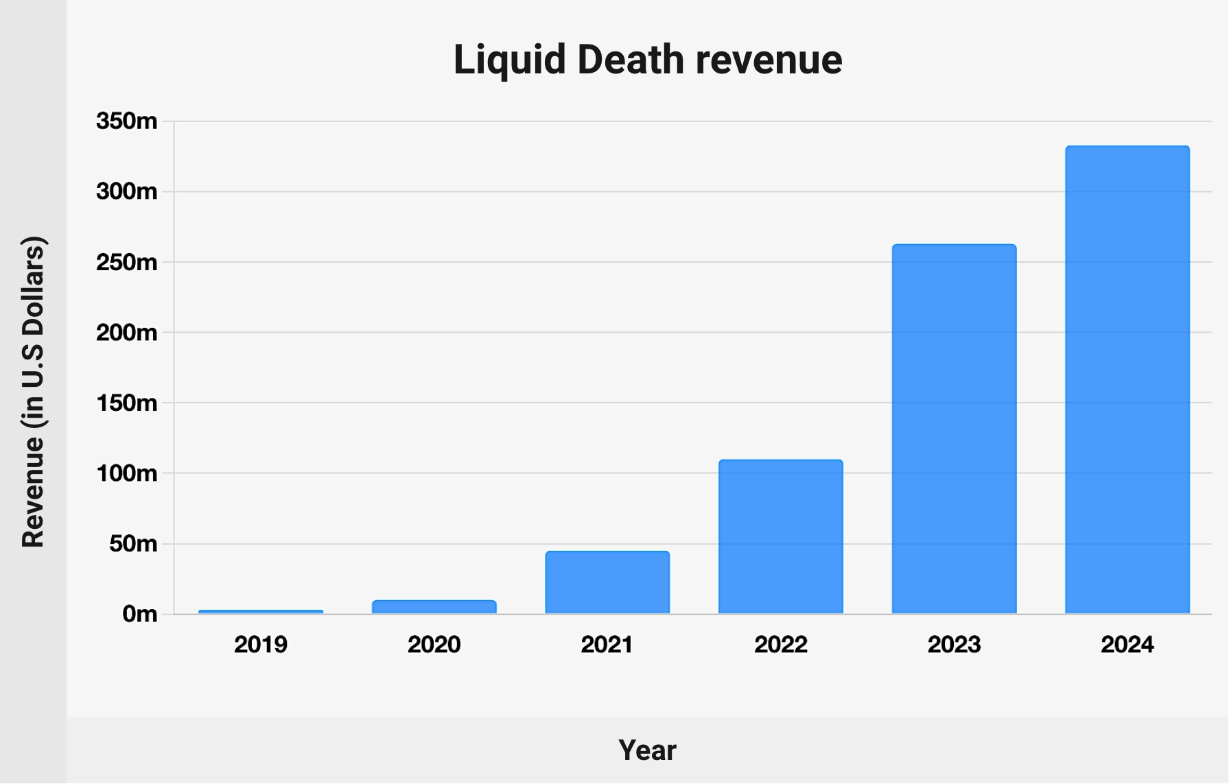
The brand has gainedcult status, becoming something more than just a drink, a lifestyle gadget that you can proudly hold in your hand at concerts or in the skate park. Responsible for the consistency of this message include, among others: creative director with official titleDirector of Visual Propaganda, Alex Lang, who makes sure that every element, from the can, through merch with skulls, to memes on social media, is maintained in the uncompromising style of the brand. Liquid Death shows thatbold, funny and slightly shocking visual communicationcan breathe new life (or maybe death?) even into such a „colorless” category as drinking water.
MTV – the logo that lived (1980s and 1990s)
On August 1, 1981, American youth saw something never seen before on their TV screens – the MTV music channel launched with a cult sequence: an astronaut on the Moon planting a flag with the MTV logo flashing in all colors. From the very beginning of its existence, MTV broke with the rule that the logo must have a constant appearance.The famous three letters „MTV”designed by the New York studio Manhattan Design were conceived aslogo in constant metamorphosis2. The sign itself in its basic form consisted of a massive, three-dimensional letter „M” and a spray-painted graffiti „tv”, the combination of the rebellion of street graffiti culture with the solidity of the block of the main letter reflected both the youthful rebellion and the seriousness of music as art. But what was most revolutionary was the fact thatno permanent color or texture was assigned to it.
From the beginning, the MTV logo appeared in an endless number of variants: one moment covered with a zebra pattern, the next all polka dots, then with a brick texture or neon colors of the 1980s. As creative director Fred Seibert recalled, the bold letter „M” gave the impression that „it has movement in it, even when it stands still„, because something was constantly happening to her.
This approach to the visual identification of a television station was an absolute novelty. Three young designers from Manhattan Design: Pat Gorman, Frank Olinsky and Patti Rogoff created a sign for MTV that could take any form and color without losing recognition. Thanks to this, MTV has become not only a music channel, but alsographic art platform. Each music video announcement or airing was an opportunity to present a new, surprising logo animation. Viewers were waiting to see what the logo would do this time, and it could come to life as a moving green goo, explode like a paint bomb, or turn into a cartoon character.No permanent colorsand stylistic freedom made MTVit always seemed fresh and up to date, because the logo could evolve with the fashions and aesthetics of the following years, from the bright, colorful colors of the 1980s to the slightly more subdued or grunge atmosphere of the 1990s.
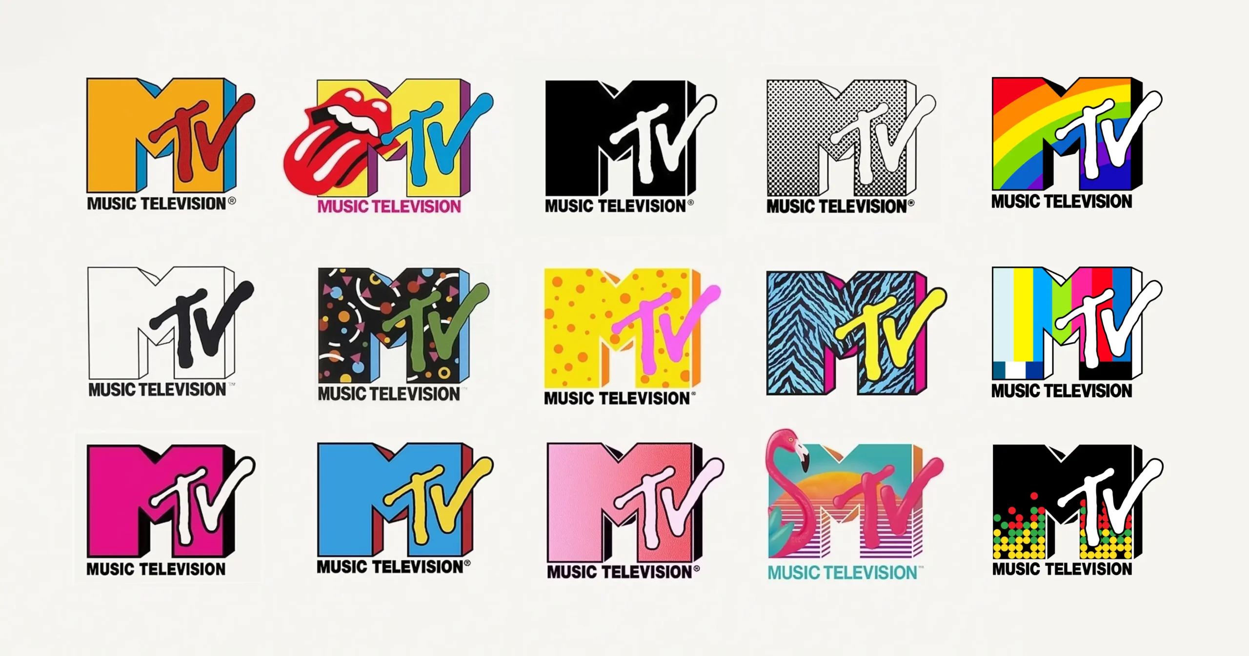
Interestingly, in 1994 a subtle modification was made,The „M” flattened and turned black in Helvetica fonts, adapting to the new decade, while still maintaining the dynamic character of the whole. And when MTV removed the „Music Television” inscription from the logo around 2010 and simplified the form, many fans felt nostalgic for the times when the logo had a life of its own.
Neverthelessthe legacy of the original MTV logo is undeniable. The MTV logo is considered one of the best logos of all time thanks to its designadaptability and uniqueness. MTV showed that a brand aimed at young people must be as dynamic as youth itself. Thisa visual language of rebellion and creativityhas become synonymous with MTV and an essential element of its cultural influence. To this day, every mention of the old MTV brings to mind colorful variations of the logo and memorable animated interludes, and this is the best proof of howis strongly rememberedwell designed,iconic visual communication.
Merck – science in psychedelic colors
New Merck logo from 2015it looked as if something very colorful had gotten out of control in the corporate pharmaceutical world. When the German company Merck KGaA (operating outside the US, where there is a separate Merck & Co.) announced in 2015visual rebranding, reactions were mixed.
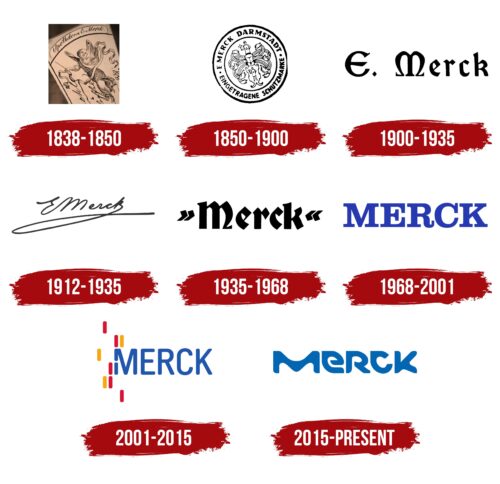
One of the oldest chemical and pharmaceutical concerns broke away from the subdued elegance of its current image and presented to the world a logo and full identification.bright colors, fluid shapes and futuristic typography. This change was not a whim, it reflected the transformation of the company. Merck wanted to be seen not just as a traditional drugmaker, but asa „living”, innovative science and technology company, vibrant with creativity and new technologies. The new positioning slogan was:Vibrant Science & Technology, and the FutureBrand agency, known for its bold projects for global brands, was responsible for the creation.
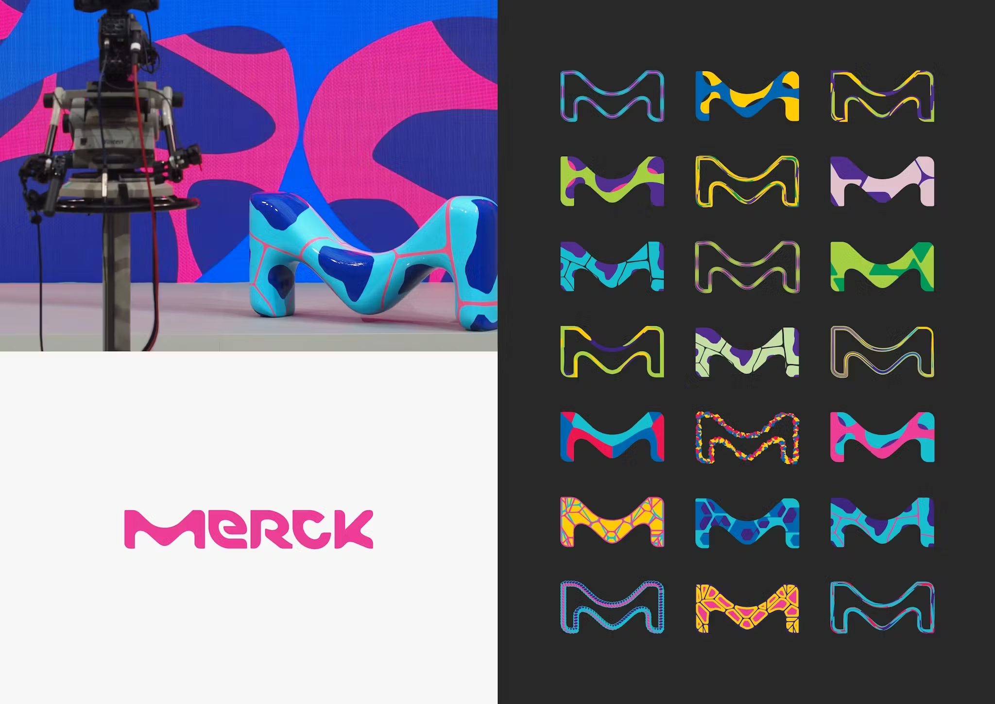
The inspiration for Merck’s new visual language was sought… under a microscope.„Colorful, diverse shapes viewed on a micro scale”, cells, crystals, microorganisms, which served as a template to create a whole range of graphic forms. The new Merck logo is the company name written downa unique typeface, where each letter is made of round, irregular forms resembling amoebas or drops. There are no sharp edges of a classic font here, but they are thereovals, „tears” and sharp curves, together creating the effect of something organic and at the same time modern. The letter „M” at the beginning, which was named, is particularly characteristic„Vibrant M”and became the company’s symbol: a modular graphic sign, often used on its own in campaigns. Importantly, the Merck logothere is no one set color– similarly to MTV, although the industry is at the opposite extreme. In line with the new strategya full spectrum of vivid colors is used, selecting the shade depending on the context and medium.
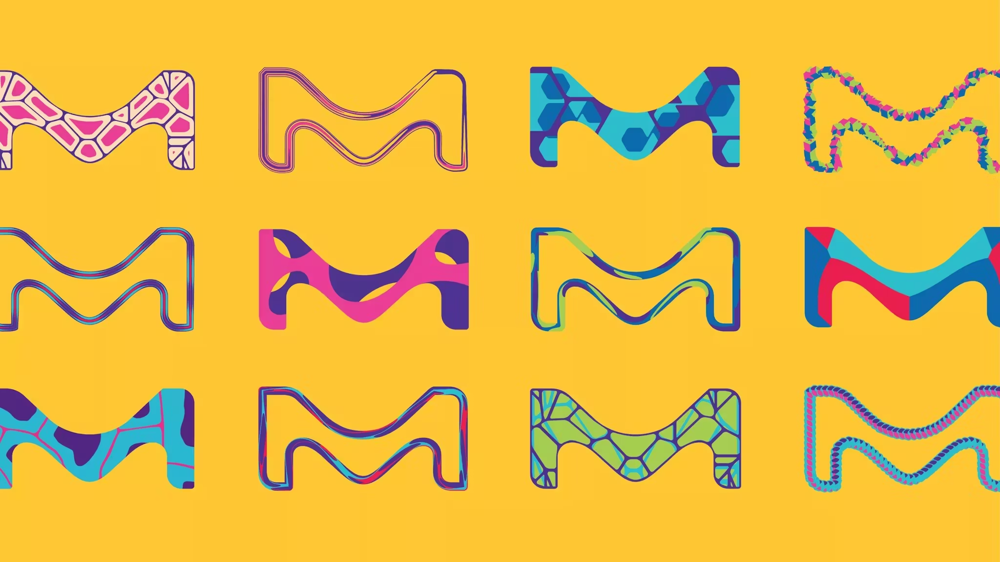
Sometimes the „M” hits the eyes with magenta on a yellow background, other times a striking cyan is adjacent to orange or green. This riot of colors, bold and joyful, definitely distinguishes Merck from the competition, accustomed to sterile white or calm navy blue. As company representatives admitted,they wanted to escape from the „sea of uniformity”in your industry and show Merck as„a very creative, dynamic company”. New visual systembreaks category conventions: connectsprecision with imagination, balancestechnical rigor with human emotion, even using monospace fonts on a grid in print designs, but surrounded by fluid splashes of color.
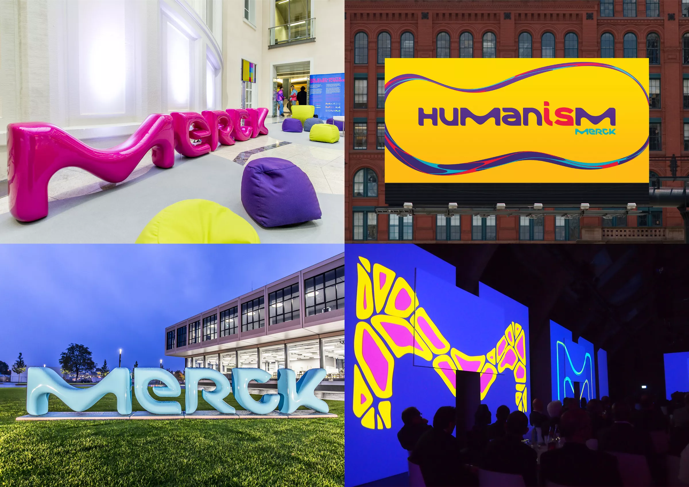
Initially, such a radical rebranding (the first in many decades) aroused astonishment: can a serious pharmaceutical company communicate in a language straight from a science-fiction cartoon? However, Merck has proven thatbold moves pay off. Not only the new identificationmade it easier to tell the differencecompany on the global market (e.g. dispelling confusion with the American Merck & Co.), but also integrated employees around a fresh vision.„We are one unique company”. the new logo seemed to say,“globally coherent, forward-looking and unquestionably colorful”. Today, years later, Merck’s image still retains this originality –Vibrant Mhas become a recognizable symbol of innovation, and the brand boldly shows the world its „true colors„This story proves that even in a conservative industry, it is possible to becomevisual pioneer, if you have the courage to go beyond the usual patterns.
Braniff International – the end of the „boring plane”
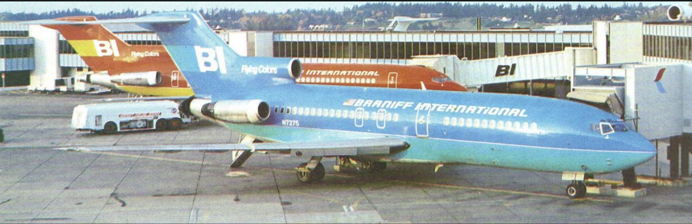
At the end of 1965, US residents were astonished to see jets painted orange, turquoise or yellow at the airport. Braniff International Airways announced„The End of the Plain Plane”, That isthe end of the era of common airplanesand they kept their words3. Behind this bold campaign was Mary Wells Lawrence (yes, the same one who was responsible for the creation of the„And ❤️ New York”), the charismatic creative director of an advertising agency, and the new president of Braniff, Harding Lawrence (Mary’s future husband). They decided to completely change the image of the line, which had previously been associated with a rather conservative nature (typical painting in white, navy blue and red, like most of the competition of those years).
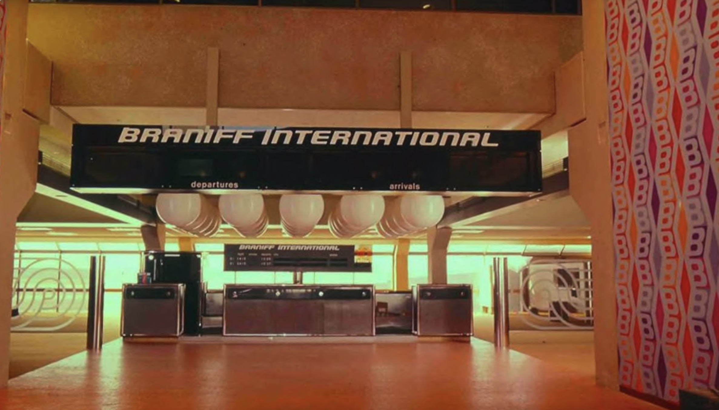
An architect-designer was invited to cooperateAlexander Girardand an Italian fashion designerEmilio Pucci, a duo that was intended to bring us to earth and to the skiesa riot of colors and patternsstraight from the most extravagant catwalks and design salons. Known for his love of folk motifs and vibrant colors, Girard took on the task of completely redesigning everything related to the Braniff passenger experience, from aircraft painting, through cabin interiors, to the logo, stationery and… toilet soaps. In total, he designed or refreshedover 17 thousand elementsidentification! What he did can be safely calledthe first ever such comprehensive rebranding of an airline.
The most noticeable change wasfleet paint scheme. Girard wanted literally (and figuratively)break the monotonythe then dominant white wings and silvery aluminum fuselages. „The idea was to make the plane look like a race car, with a fuselage in a uniform, expressive color emphasizing the shape of the machine.” He proposeda palette of seven juicy colorsvarnishes:yellow, orange, turquoise, dark blue, light blue, ocher and beige. In addition, there was a black „nose” at the front, white wings and a tail stabilizer, while the rest of the fuselage was covered in intense color from the nose to the tail. Braniff boasted in their advertisements that a passenger could fly with them seven times and fly a different colored plane each time. The sight of these „jelly bean jets” (planes like jelly beans) at airports was absolutely unusual and immediately associated with the brand.
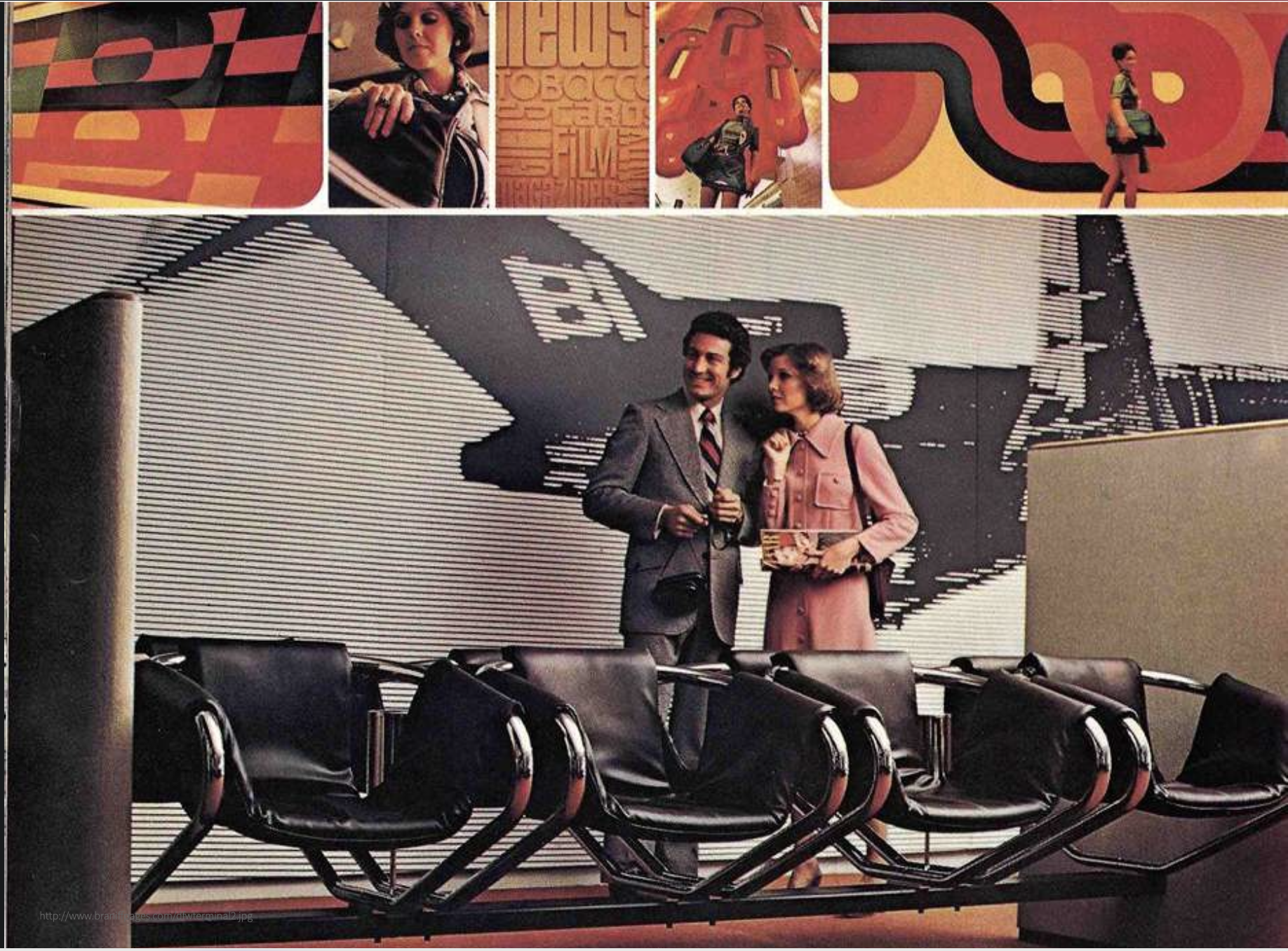
Not only were planes painted with colors,these have become a leitmotif throughout Braniff’s identity. Girard designed a new, stylized logo and a new corporate typeface used from flight schedules to aircraft tail lettering. The interiors of the cabins received seven different color variants of the design, matching the exterior color, the armchairs were upholstered with fabrics with vivid patterns (grids, stripes) of his design, and the carpets, curtains and even napkins were also selected for specific palettes.
The sky design has become consistent from A to Z: Business Class lounges were equipped with futuristic furniture designed by Girard and his friends, the famous designers Eames, and the smallest details, from boarding passes through plates to playing cards distributed to passengers, had a new graphic design related to the campaign. You could get the impression that when you got into Braniff you were entering a different, colorful world of the 1960s.
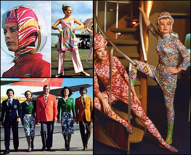
They were a separate chaptercrew uniforms, designed by Emilio Pucci, the famous fashion designer. His outfits for Braniff from the collectionGemini 4(presented since 1965) is quintessential„Jet Age” style: stewardesses wore chic costumes in rich colors, complemented byvinyl go-go boots(fashionable boots) and transparent“space” plexiglass helmetsworn when it rains. Pucci combined the elegance of haute couture with futurism. His designs looked almost like uniforms from sci-fi movies about the conquest of space.
Braniff’s advertising campaigns were striking: in the famous spot „The Air Strip” there was a stewardessin flightshe took off the layers of the Pucci uniform, revealing other stylish elements, all with a wink to show the diversity of outfits and emphasize the freedom of the new times.The flight from Braniff became an experience in itself. Travel has become not just movement, but part of a holiday adventure, full of color, fashion and design.
Braniff hisa visual revolutionbroke every aviation industry standard of the era. In the 1960s, airlines focused on a conservative image of a „trusted carrier” and subdued colors and universal uniforms.
Branif proved that you can approach the topic differently: make it an airlinelifestyle brand, which is ahead of trends. The slogan „The End of the Plain Plane” turned out to be a hit, and Braniff immediately became the most recognizable airline in the USA, ahead of its time by a decade. It is true that the airlines did not survive the industry crises financially and ultimately went bankrupt in the early 1980s, but theirthe design heritage is still alive.
Braniff has become a case study in marketing and design textbooks. He showed thata bold creative vision– a bold color palette, cooperation with artists (later the artist Alexander Calder also painted airplanes for Braniff), can take the brand to the topcult status. To this day, Braniff airplane models in Girard’s colors and photos of stewardesses in Pucci outfits circulate on Pinterest as symbols of the most stylish era of aviation. This story proves that sometimes it is worth „painting the whole world orange”, as long as it is consistent, bold and sensitive, and the brand will go down in gold (and colorful) letters in the history of visual communication.
End
The stories of Oatly, Liquid Death, MTV, Merck and Braniff show thatunique visual communication can become a lever of brand success. Although each of these companies operates in a different industry and in a different era, they have a common denominator:readiness to break patterns. From handwritten humor on a milk carton, through heavy metal aesthetics on a water can, to a music channel logo that changes like a chameleon, boldness in design has built their identity. By introducingnew colors, shapes and ideas, these brands stood out from the crowd of competitors, gained notoriety and fan loyalty. Their style works because it comes from an authentic philosophy (whether it is a balanced rebellion against „cow’s” milk or a youthful need for expression) and at the same timememorablethanks to coherent, well-thought-out creation. It can be said that each of these brands has created its own visual language and speaks it loudly, clearly and sometimes perversely. In a world full of stimuli, these are the onesexpressive graphic storieswe remember for years.
Sources