Responsive Web Design vs. Adaptive Web Design – what’s the difference?
Responsive Web Design and Adaptive Web Design have their advantages and disadvantages. In the article I will discuss their differences, which will bring you closer to making a good decision.

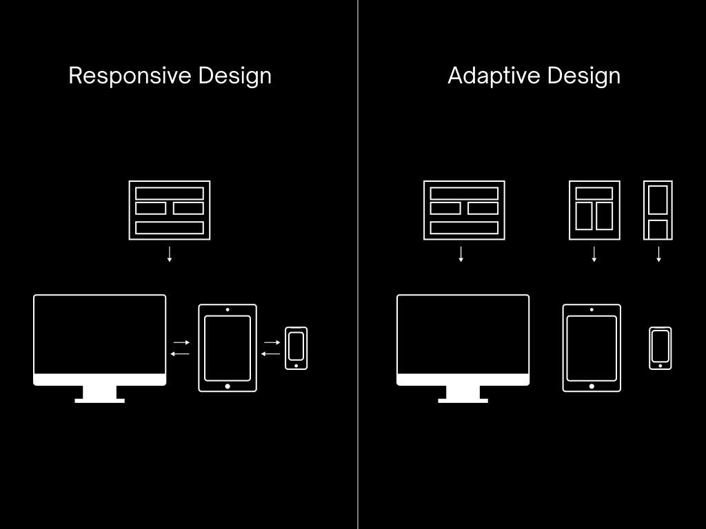
Are you a designer or developer wondering which design method to choose for your next project? Decision betweenresponsive website design(RWD) aadaptive website design(AWD) can be difficult. Both approaches have their advantages and disadvantages, and understanding the differences between them is crucial to creating a successful website. In this article, I’ll discuss the differences between RWD and AWD and help you make an informed decision about which method is best for your project.
Responsivenessrefers to the ability of a website to adapt to different screen sizes and resolutions so that it looks good and is easy to use on any device, whether it is a desktop computer, tablet or smartphone. Responsive design achieves this by using flexible grids, images, and CSS media queries to adapt the page layout to the screen size of the device on which it is viewed. Responsiveness is considered standard today. Of course, this is not always the only strategy, but its primary purpose is to provide usersoptimal visual experiencewhen using the interface.
Often thanks to projects based on the so-called grids, it is possible to easily adjust the framework (layout) to the screen size. In other words – the content on the website or application must be readable by the visitor by adjusting the page size on all devices.
Adaptive design
Adaptive Web Design (AWD)aims to provide the best viewing experience on a specific device, such as a laptop, computer, phone, tablet, etc. This strategy provides dedicated views for each device separately.
Adaptive design, unlike responsive design, which adapts the layout of a website to each screen size, creates separate versions of a website for different devices. This allows designers and developers to optimize website performance for each device individually, leading to a better user experience and often faster loading times.
Responsive Design
Responsive Web Design (RWD)is an approach to web design that makes web pages render well on a variety of devices and windows or screen sizes.
In simple words, we can say that RWD is a type of web design,which can be customizedto the type of device such as laptop, mobile phone, tablet, computer etc. RWD is intended to provide users with an optimal viewing experience as the layout can adjust the minimum size, panning and scrolling.
The reason for this flexibility is the fluid mesh used to create this layout, which allows the design to work regardless of screen size. RWD can be compared to the scenario of one ball that shrinks and grows according to different hoops.
Adaptive Web Design vs. Responsive Web Design

The adaptive design uses a series of static circuits based on so-called breakpoints. Breakpoints. For example, you can design a website in three different sizes: 320 for mobile phones, 760 pixels for tablets, and 960 for desktop browsers. Adaptive files do not respond after loading. Responsive is where the design responds by adjusting the browser window. Detects the device and calls the appropriate layout size to display.
Responsive Web Designcan provide the user with an optimal experience regardless of the device they are viewing the project on. It also allows you to optimize one project for more than one environment. However, you may have less control over how things look if you take a fluid approach by using percentage-based scaling. In this case, media queries still open up the scope of layout possibilities, as mentioned earlier.
Below are the points highlighted by top mobile app developers that distinguish two popular design patterns:
| Responsive Design | Adaptive Design |
| One design for multiple devices and platforms. | Multiple designs for multiple devices and platforms. |
| More user-friendly design layouts, but slower in terms of load times. | Less user-friendly design layouts, but faster loading times. |
| Uses CSS media queries to change display type, width, height, etc. | It uses static layouts to offer customized 'no point’ based solutions. |
| It ensures hassle-free operation because it responds immediately to the dimensions of the device. | Automatically adjusts and renders correctly to the screen size, regardless of platform or device. |
| More consistent and consistent, it offers functionality where one design fits all devices and sizes. | Delivers a modern experience with contextual performance and usability. |
Currently, most transactions and sessions take place exclusively using a smartphone. Having a mobile-friendly website is now a standard, even a requirement, because it affects your position in the Google search engine.
More than just good layout responsive design also contributes to creating a more cohesive and consistent brand presence online. Having one website for several devices and dimensionsleads to lower development and maintenance costs.Not only will it benefit you financially in the long run, but it will also help youimprove your organic conversion or sales rate, which is usually the end goal.
Responsive design is the “traditional” choice and remains the most popular design approach among mobile and web app developers. However, adaptive design is also a good option for investments with a high budget and more complex systems. The choice of a given option depends largely on the scope, budget and goal of the project.
Frequently asked questions and answers
What is Responsive Web Design (RWD)?
What is Adaptive Web Design (AWD)
When to use Responsive Web Design (RWD) and when to use Adaptive Web Design (AWD)?
What are the cost differences in implementing Responsive Web Design (RWD) and Adaptive Web Design (AWD)?
Which solution is better for the user?
Sources:
https://www.amarinfotech.com/responsive-vs-adaptive-web-design.html
https://www.responsiveinboundmarketing.com/blog/responsive-vs.-adaptive-design-the-benefits-of-each
https://css-tricks.com/the-difference-between-responsive-and-adaptive-design/
https://css-tricks.com/snippets/css/media-queries-for-standard-devices/